Are you interested in saving money, but don’t know where to start? Do you want to make sure you focus your money saving muscle in the area where you will actually see the most benefit? Do you just love creating charts and graphs in Excel?
If you answered yes to any of these questions, then read on to find out how you can create our own money saving plan using pareto charts!
What Are Pareto Charts?
Have you ever heard the saying that 20% of the people create 80% of the problem? That’s basically the Pareto rule in effect. This “rule” is found to work well in nearly all facets of life. I think the same also holds true with our normal monthly budget. We typically have 20% of our monthly items accounting for 80% of our total household budget. If you can learn to focus on improving in these “heavy-hitter” areas, you can make a real dent in your monthly expenditures!
Now that we understand the basic idea of Pareto, we can put this to use with charts to really help visualize where our money saving opportunities can be found. I did some of this work for our own expenses, and it really did help us save a bunch of extra money by focusing on big items.
How to Create a Monthly Spending Pareto Chart
Creating a monthly spending Pareto chart is a straightforward process that should only take a few minutes. The steps to create your own monthly spending pareto chart in Excel are:
- List out all your monthly expense categories in one column (groceries, rent, electricity, water, etc.)
- Track you spending in each category for several months. I recommend recording data for at least three months to get a good average. You can place this data in columns 2-4. If you would like to look at even more than three months, then go for it!
- Calculate a monthly average for each category and place this in the last column (column 5 if you are working with 3 months of data)
- Sort the entire list of categories, monthly expenses, and monthly averages using the monthly average column. Sort this descending (this will place the highest expenses at the top of the list)
- Highlight your category column and your monthly average column and click the bar chart button. You now should have a generic monthly spending pareto chart.
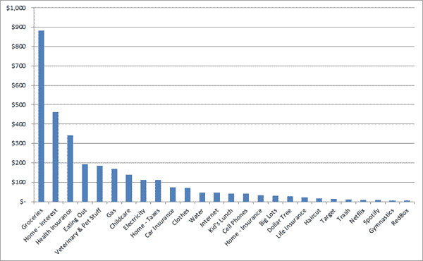
When you are all done, it should look something like this:
Pareto Charts in Excel
I have a YouTube video ready to go below that that shows you just how to do this. Check it out now!
OK, So I have My Monthly Spending Pareto Chart – What Now?
Now that you’ve created your monthly spending Pareto chart, you can start to analyze it for money saving ideas. You will want to focus much of your money saving brainstorming in two areas:
- quick hitters – these are expenses that may be pretty low down on the list but would be easy to reduce. Easy quick hitters examples for money savings are switching to a cheaper cell phone plan, getting rid of cable, and cutting out short term disability, cutting back shopping at Big Lots to name just a few…
- big hitters – these are big expenses that soak up a majority of your hard earned dollars. These will typically be difficult to reduce in the short-term, but in the longer term you want to create plans to minimize these if your goal is to save as much money as possible. Typical big hitter items could be: student loans, mortgage interest, eating out, groceries, daycare, etc.
Why Focusing on Big Hitters is Important
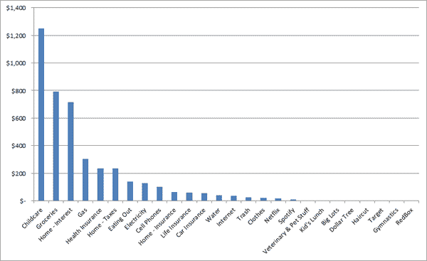
Using a Pareto Chart for your monthly expenses can really help to put your monthly expenses into perspective. Look at the example below as to where we were spending our money just a couple of years ago.
You can see that if we were really going to improve our savings, we really had to focus on getting childcare and home interest down. Those were huge expenses for us!
As I mentioned up above, getting the spending down on your big hitter items can be tricky. These are typically monthly expenses that are quite hard to reduce or get out of such as a mortgage or student loans. Looking at reducing spending in these areas when the chance arises can really pay off huge dividends in terms of your net worth in the long run. Our monthly spending Pareto showed us that we were spending a huge amount on daycare and housing. When we moved to Georgia for my job, my wife and I made it a priority to downsize our home and plan out a work/life balance where we could minimize daycare costs.
By paying close attention to our monthly spending Pareto chart, we were able to reduce our monthly expenses by more than $1,500 when the time came to relocate!
Create Your Own Money Saving Plan Using Pareto Charts – Final Thoughts
Creating your own money saving plan using Pareto charts can be a great way to get your monthly expenses back on track. A money spending Pareto chart helps you to put your monthly expenses in perspective and gives you several ideas where you can save a ton of money. By looking for quick hitters and big hitters in your monthly spending, you are sure to develop a money saving plan that will payoff big time!


